SHAP Values
You’ve seen (and used) techniques to extract general insights from a machine learning model. But what if you want to break down how the model works for an individual prediction?
SHAP Values (an acronym from SHapley Additive exPlanations) break down a prediction to show the impact of each feature. Where could you use this?
- A model says a bank shouldn’t loan someone money, and the bank is legally required to explain the basis for each loan rejection
- A healthcare provider wants to identify what factors are driving each patient’s risk of some disease so they can directly address those risk factors with targeted health interventions
How They Work
SHAP values interpret the impact of having a certain value for a given feature in comparison to the prediction we’d make if that feature took some baseline value.
In these tutorials, we predicted whether a team would have a player win the Man of the Match award.
We could ask:
- How much was a prediction driven by the fact that the team scored 3 goals?
But it’s easier to give a concrete, numeric answer if we restate this as:
- How much was a prediction driven by the fact that the team scored 3 goals, instead of some baseline number of goals.
Of course, each team has many features. So if we answer this question for number of goals, we could repeat the process for all other features.
SHAP values do this in a way that guarantees a nice property. Specifically, you decompose a prediction with the following equation:
sum(SHAP values for all features) = pred_for_team - pred_for_baseline_values
That is, the SHAP values of all features sum up to explain why my prediction was different from the baseline. This allows us to decompose a prediction in a graph like this:
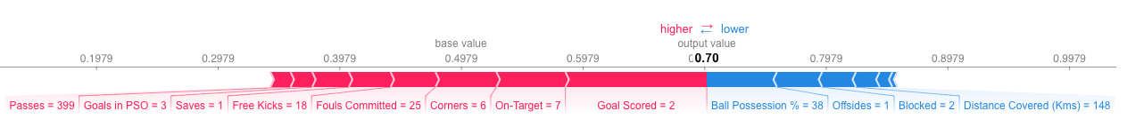
How do you interpret this?
We predicted 0.7, whereas the base_value is 0.4979. Feature values causing increased predictions are in pink, and their visual size shows the magnitude of the feature’s effect. Feature values decreasing the prediction are in blue. The biggest impact comes from Goal Scored being 2. Though the ball possession value has a meaningful effect decreasing the prediction.
If you subtract the length of the blue bars from the length of the pink bars, it equals the distance from the base value to the output.
There is some complexity to the technique, to ensure that the baseline plus the sum of individual effects adds up to the prediction (which isn’t as straightforward as it sounds). We won’t go into that detail here, since it isn’t critical for using the technique. This blog post has a longer theoretical explanation.
Code to Calculate SHAP Values
We calculate SHAP values using the wonderful Shap library.
For this example, we’ll reuse the model you’ve already seen with the Soccer data.
import numpy as np
import pandas as pd
from sklearn.model_selection import train_test_split
from sklearn.ensemble import RandomForestClassifier

data = pd.read_csv('../input/fifa-2018-match-statistics/FIFA 2018 Statistics.csv')
y = (data['Man of the Match'] == "Yes")  # Convert from string "Yes"/"No" to binary
feature_names = [i for i in data.columns if data[i].dtype in [np.int64, np.int64]]
X = data[feature_names]
train_X, val_X, train_y, val_y = train_test_split(X, y, random_state=1)
my_model = RandomForestClassifier(random_state=0).fit(train_X, train_y)
We will look at SHAP values for a single row of the dataset (we arbitrarily chose row 5). For context, we’ll look at the raw predictions before looking at the SHAP values.
row_to_show = 5
data_for_prediction = val_X.iloc[row_to_show]  # use 1 row of data here. Could use multiple rows if desired
data_for_prediction_array = data_for_prediction.values.reshape(1, -1)


my_model.predict_proba(data_for_prediction_array)
array([[0.29, 0.71]])
The team is 70% likely to have a player win the award.
Now, we’ll move onto the code to get SHAP values for that single prediction.
import shap  # package used to calculate Shap values

# Create object that can calculate shap values
explainer = shap.TreeExplainer(my_model)

# Calculate Shap values
shap_values = explainer.shap_values(data_for_prediction)
The shap_values object above is a list with two arrays. The first array is the SHAP values for a negative outcome (don’t win the award), and the second array is the list of SHAP values for the positive outcome (wins the award). We typically think about predictions in terms of the prediction of a positive outcome, so we’ll pull out SHAP values for positive outcomes (pulling out shap_values[1]).
It’s cumbersome to review raw arrays, but the shap package has a nice way to visualize the results.
shap.initjs()
shap.force_plot(explainer.expected_value[1], shap_values[1], data_for_prediction)
If you look carefully at the code where we created the SHAP values, you’ll notice we reference Trees in shap.TreeExplainer(my_model). But the SHAP package has explainers for every type of model.
shap.DeepExplainerworks with Deep Learning models.shap.KernelExplainerworks with all models, though it is slower than other Explainers and it offers an approximation rather than exact Shap values. Here is an example usingKernelExplainerto get similar results. The results aren’t identical because KernelExplainer gives an approximate result. But the results tell the same story.
# use Kernel SHAP to explain test set predictions
k_explainer = shap.KernelExplainer(my_model.predict_proba, train_X)
k_shap_values = k_explainer.shap_values(data_for_prediction)
shap.force_plot(k_explainer.expected_value[1], k_shap_values[1], data_for_prediction)
Example Scenario
A hospital has struggled with “readmissions,” where they release a patient before the patient has recovered enough, and the patient returns with health complications.
The hospital wants your help identifying patients at highest risk of being readmitted. Doctors (rather than your model) will make the final decision about when to release each patient; but they hope your model will highlight issues the doctors should consider when releasing a patient.
The hospital has given you relevant patient medical information. Here is a list of columns in the data:
import pandas as pd
data = pd.read_csv('../input/hospital-readmissions/train.csv')
data.columns
Index(['time_in_hospital', 'num_lab_procedures', 'num_procedures',
       'num_medications', 'number_outpatient', 'number_emergency',
       'number_inpatient', 'number_diagnoses', 'race_Caucasian',
       'race_AfricanAmerican', 'gender_Female', 'age_[70-80)', 'age_[60-70)',
       'age_[50-60)', 'age_[80-90)', 'age_[40-50)', 'payer_code_?',
       'payer_code_MC', 'payer_code_HM', 'payer_code_SP', 'payer_code_BC',
       'medical_specialty_?', 'medical_specialty_InternalMedicine',
       'medical_specialty_Emergency/Trauma',
       'medical_specialty_Family/GeneralPractice',
       'medical_specialty_Cardiology', 'diag_1_428', 'diag_1_414',
       'diag_1_786', 'diag_2_276', 'diag_2_428', 'diag_2_250', 'diag_2_427',
       'diag_3_250', 'diag_3_401', 'diag_3_276', 'diag_3_428',
       'max_glu_serum_None', 'A1Cresult_None', 'metformin_No',
       'repaglinide_No', 'nateglinide_No', 'chlorpropamide_No',
       'glimepiride_No', 'acetohexamide_No', 'glipizide_No', 'glyburide_No',
       'tolbutamide_No', 'pioglitazone_No', 'rosiglitazone_No', 'acarbose_No',
       'miglitol_No', 'troglitazone_No', 'tolazamide_No', 'examide_No',
       'citoglipton_No', 'insulin_No', 'glyburide-metformin_No',
       'glipizide-metformin_No', 'glimepiride-pioglitazone_No',
       'metformin-rosiglitazone_No', 'metformin-pioglitazone_No', 'change_No',
       'diabetesMed_Yes', 'readmitted'],
      dtype='object')
Here are some quick hints at interpreting the field names:
- Your prediction target is readmitted
- Columns with the word diag indicate the diagnostic code of the illness or illnesses the patient was admitted with. For example, diag_1_428 means the doctor said their first illness diagnosis is number “428”. What illness does 428 correspond to? You could look it up in a codebook, but without more medical background it wouldn’t mean anything to you anyway.
- A column names like glimepiride_No mean the patient did not have the medicine glimepiride. If this feature had a value of \( \texttt{False} \), then the patient did take the drug glimepiride Features whose names begin with medical_specialty describe the specialty of the doctor seeing the patient. The values in these fields are all \( \texttt{True} \) or \( \texttt{False} \).
You have built a simple model, but the doctors say they don’t know how to evaluate a model, and they’d like you to show them some evidence the model is doing something in line with their medical intuition. Create any graphics or tables that will show them a quick overview of what the model is doing?
They are very busy. So they want you to condense your model overview into just 1 or 2 graphics, rather than a long string of graphics.
We’ll start after the point where you’ve built a basic model. Just run the following cell to build the model called my_model.
import pandas as pd
from sklearn.ensemble import RandomForestClassifier
from sklearn.model_selection import train_test_split

data = pd.read_csv('../input/hospital-readmissions/train.csv')

y = data.readmitted

base_features = [c for c in data.columns if c != "readmitted"]

X = data[base_features]

train_X, val_X, train_y, val_y = train_test_split(X, y, random_state=1)
my_model = RandomForestClassifier(n_estimators=30, random_state=1).fit(train_X, train_y)
Now use the following cell to create the materials for the doctors.
import eli5
from eli5.sklearn import PermutationImportance

perm = PermutationImportance(my_model, random_state=1).fit(val_X, val_y)
eli5.show_weights(perm, feature_names = val_X.columns.tolist())
| Weight | Feature |
|---|---|
| 0.0451 ± 0.0068 | number_inpatient |
| 0.0087 ± 0.0046 | number_emergency |
| 0.0062 ± 0.0053 | number_outpatient |
| 0.0033 ± 0.0016 | payer_code_MC |
| 0.0020 ± 0.0016 | diag_3_401 |
| 0.0016 ± 0.0031 | medical_specialty_Emergency/Trauma |
| 0.0014 ± 0.0024 | A1Cresult_None |
| 0.0014 ± 0.0021 | medical_specialty_Family/GeneralPractice |
| 0.0013 ± 0.0010 | diag_2_427 |
| 0.0013 ± 0.0011 | diag_2_276 |
| 0.0011 ± 0.0022 | age_[50-60) |
| 0.0010 ± 0.0022 | age_[80-90) |
| 0.0007 ± 0.0006 | repaglinide_No |
| 0.0006 ± 0.0010 | diag_1_428 |
| 0.0006 ± 0.0022 | payer_code_SP |
| 0.0005 ± 0.0030 | insulin_No |
| 0.0004 ± 0.0028 | diabetesMed_Yes |
| 0.0004 ± 0.0021 | diag_3_250 |
| 0.0003 ± 0.0018 | diag_2_250 |
| 0.0003 ± 0.0015 | glipizide_No |
| … 44 more … |
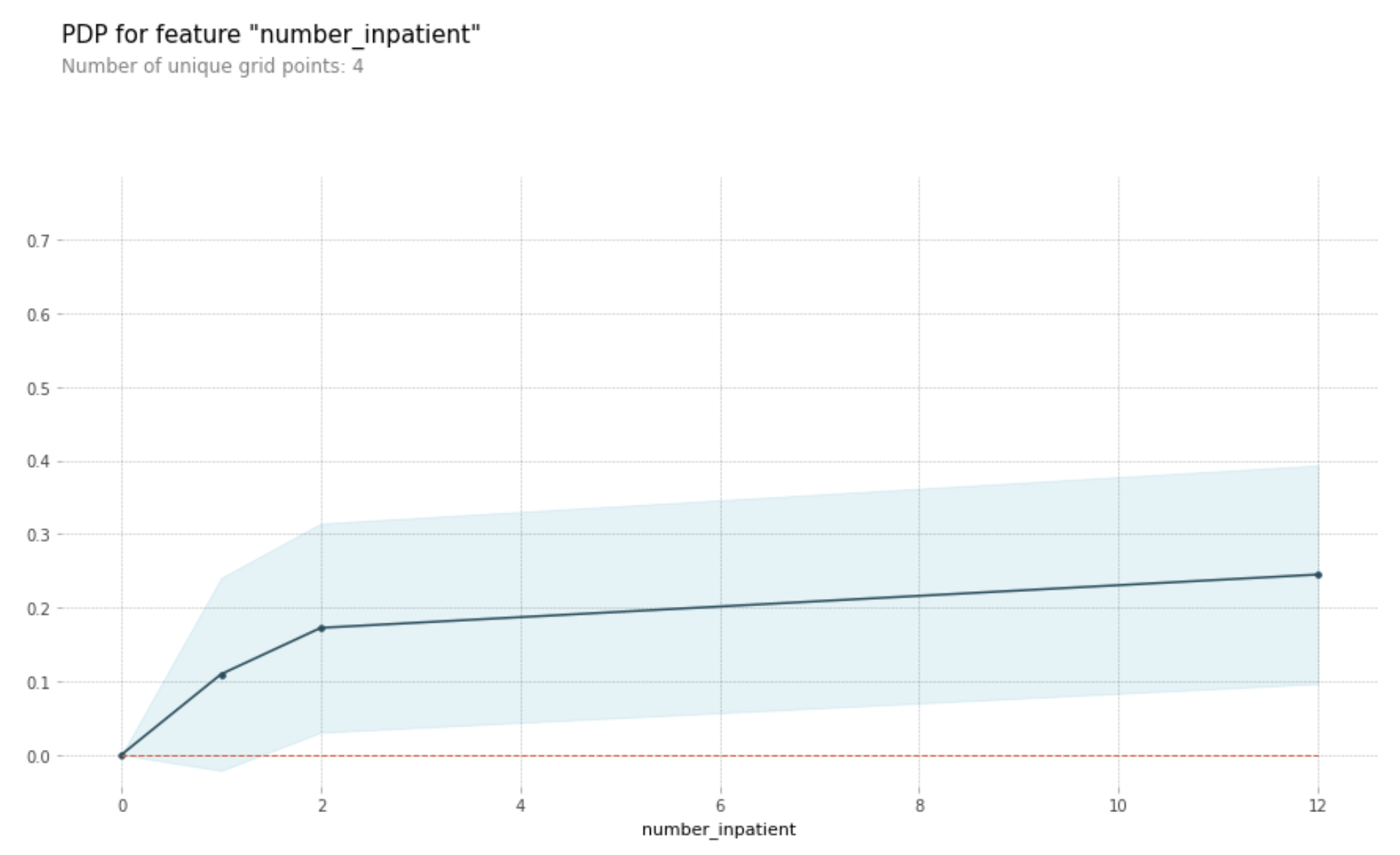
It appears number_inpatient is a really important feature. The doctors would like to know more about that. Create a graph for them that shows how num_inpatient affects the model’s predictions.
# PDP for number_inpatient feature

from matplotlib import pyplot as plt
from pdpbox import pdp, get_dataset, info_plots

feature_name = 'number_inpatient'
# Create the data that we will plot
my_pdp = pdp.pdp_isolate(model=my_model, dataset=val_X, model_features=val_X.columns, feature=feature_name)

# plot it
pdp.pdp_plot(my_pdp, feature_name)
plt.show()
from matplotlib import pyplot as plt
from pdpbox import pdp, get_dataset, info_plots

feature_name = 'time_in_hospital'
# Create the data that we will plot
my_pdp = pdp.pdp_isolate(model=my_model, dataset=val_X, model_features=val_X.columns, feature=feature_name)

# plot it
pdp.pdp_plot(my_pdp, feature_name)
plt.show()
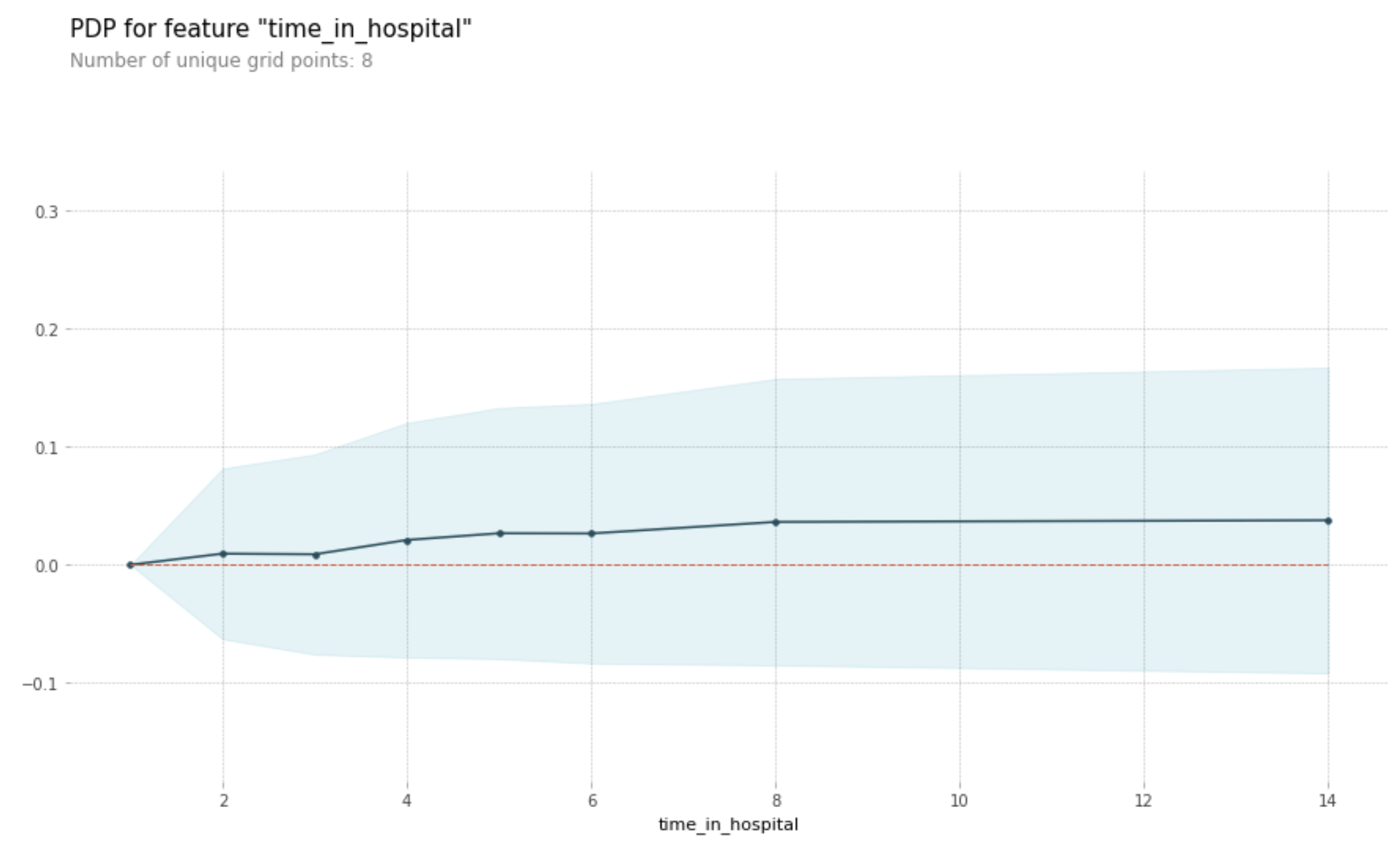
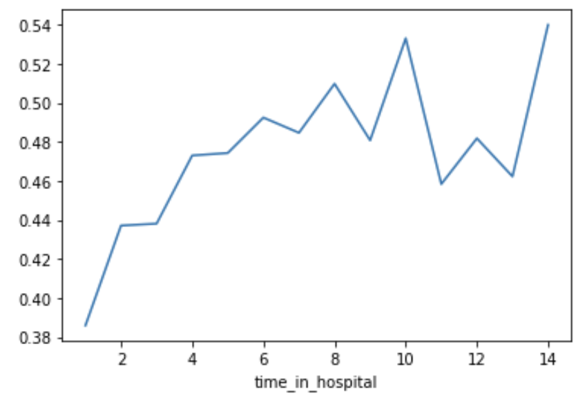
Woah! It seems like time_in_hospital doesn’t matter at all. The difference between the lowest value on the partial dependence plot and the highest value is about 5%.
If that is what your model concluded, the doctors will believe it. But it seems so low. Could the data be wrong, or is your model doing something more complex than they expect?
They’d like you to show them the raw readmission rate for each value of time_in_hospital to see how it compares to the partial dependence plot.
Make that plot. Are the results similar or different?
# Do concat to keep validation data separate, rather than using all original data
all_train = pd.concat([train_X, train_y], axis=1)

all_train.groupby(['time_in_hospital']).mean().readmitted.plot()
plt.show()
Now the doctors are convinced you have the right data, and the model overview looked reasonable. It’s time to turn this into a finished product they can use. Specifically, the hospital wants you to create a function patient_risk_factors that does the following
- Takes a single row with patient data (of the same format you as your raw data)
- Creates a visualization showing what features of that patient increased their risk of readmission, what features decreased it, and how much those features mattered.
It’s not important to show every feature with every miniscule impact on the readmission risk. It’s fine to focus on only the most important features for that patient.
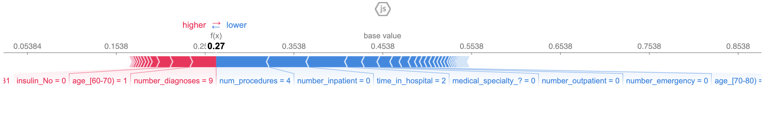
import shap  # package used to calculate Shap values

sample_data_for_prediction = val_X.iloc[0].astype(float)  # to test function

def patient_risk_factors(model, patient_data):
    # Create object that can calculate shap values
    explainer = shap.TreeExplainer(model)
    shap_values = explainer.shap_values(patient_data)
    shap.initjs()
    return shap.force_plot(explainer.expected_value[1], shap_values[1], patient_data)
patient_risk_factors(my_model, sample_data_for_prediction)